Moving from Word Press to static content
In June, we wrote about our new website look. Some time after that, Matt Gemmell wrote a blog post about “baked” web sites. The concept wasn’t new to us, but the post was published right in the middle of the time when we were playing with local Word Press installation, and due to unnecessary difficulties with the process, it resonated in our mind.
Testing new content
We had a private Word Press installation on our web server for a long time. We used it to test new content and verify updated Word Press and plugins still worked. It was fine, especially since our theme update in June which made the process much simpler. But, the process of verifying visual aspects still required time intensive “upload, refresh, check” workflow. Additionally, many Word Press settings had to be manually re-edited in public site as part of porting content from test site. So we decided to install Word Press locally on our Mac in hope to fasten the process.
Installing Word Press on local computer isn’t that difficult, but requires installation of MySQL and creating database and user in Terminal. And sure enough, none of the steps was a smooth sailing. Each required Google sessions to get specific answers when things didn’t work as expected. Finally we had the website working, so it was time to transfer the content from the main one. This also wasn’t out-of-the-box experience, but what isn’t achievable by man with determination? So in few iterations, local site was working. There were still issues which remained unresolved: the main one was with images - they still had to be uploaded to main site in order to have them usable in all sites. So the solution was far from perfect…
Our workflow at this point was: write the blog post as Markdown document, convert to HTML, copy to MarsEdit, iterate through HTML (read: publish/refresh cycle) until everything worked as expected, publish to main site. All in all, not that much of a progress as we hoped it would be. As mentioned above, it was during this time that Matt Gemmell wrote about converting his blog to baked one.
Static HTML - baked web sites
As mentioned above, we were aware of baked websites. We even did few tests in the past, but the initial setup wasn’t any simpler than local Word Press installation. Many of the generator tools are Rails based. Now, Mac OS X includes Rails out of the box, but not all the dependent libraries, so setup ended with gazillion gem install commands with each one depending on few more and… you get the point. Although the tools worked after that, installation was a pain and upgrading computer would require going again through the whole process (hopefully some of the required components wouldn’t be discontinued in the middle). Some tools installed smoothly, but they seemed a bit too simple for our needs. So we continued with Word Press.
Then in October, One Thing Well blog mentioned PieCrust static site generator. We checked the website and it seemed promising, so we gave the tool a try. PieCrust is PHP based, so it runs out-of-the-box on every Mac, no dependency libraries required (all third party code is already included) so test site was up in seconds! That was encouraging. Playing with the tool made our impression even stronger so we decided to go for it. PieCrust also works on top of Markdown (you can also use many other formatters), and as we already had our blog prepared from previous testing, we got it covered quickly.
Porting website to PieCrust
Of course, we wanted to keep using our theme, so that was next step. First attempt was to simply use HTML rendered by Word Press, but it wasn’t working very well, especially with JavaScript content such as main menu and sliders. But we remembered the theme (Highlight) was also sold as static HTML/CSS files, so we went looking for it on Theme Forest. However we were not able to find it in that format. We did find few others though and finally decided to go with Anthology, also from Pexeto. They provide solid support and the two themes shared general layout, so whatever we learned with customizing previous one, we could probably use with new one too. The “theme” sells for $15, which seemed reasonable (fully fledged Word Press themes sell for around $35 on theme forest) and even if we later decided this wasn’t it, we’d at least support Pexeto team… Decision made, so few minutes and -$15 later, we were ready to go :)
Adapting “static theme” proved much simpler than dealing with WP. It’s not point-and-click, and did require working with HTML, but was progressing much faster and individual parts could be implemented in context. For example sliding images at the top of the page: Pexeto Word Press theme includes nice administrator panel where you can click yourself through the process for each image. Then you need to go to the page and select the slider from the custom controls below the content area. While user friendly, it’s time consuming and you have to switch pages in WP dashboard to get things done. And to port to another Word Press installation, you’d have to manually repeat the whole setup… In static version, you simply write few <ul><li> lines and you’re done! And there’s no additional work to port to another site, just upload the same file to different location!
We used exitwp to copy content from WP to Markdown. Site was quickly building up and in few days the blog part was ready. We got stuck with few PieCrust issues in the middle and contacted the author through GitHub issues. The response was quick each time, we even stepped in and updated the PHP code to move things our way even quicker. After blog was done, it was time to handle the pages. Initial HTML was copied over from WP and it generally worked out of the box (surely Anthology theme being similar to Highlight worked in our favor here too). With Twig, simple template system which is default template system used by PieCrust, we could easily create a hierarchy of template files that ultimately made actual pages creation much simpler and removed lot’s of repeating elements. For example, all appledoc pages share the same template, so the context menu only needed to be implemented in that template and it was automatically used in each page. And the appledoc template is just descendant of the main template, so overall formatting and the rest was taken from there. This resulted in simple, fast and DRY (don’t repeat yourself) approach.
Few more notes on PieCrust and new look
PieCrust runs at version 0.1.3 at the moment of this writing, but it sure feels very robust and solid! Using it locally is so simple: it includes web server called chef, which is simple and effective; to check the site locally, just run chef serve and the site is rendered in your web browser on the fly - it doesn’t require generating static HTML or anything like that. If you want to test updated content, all it takes is save the Markdown source file and refresh the browser. To actually generate static content for uploading to real server, run chef bake and upload files wherever needed! Actually you don’t have to bake site to use it on your production server as PieCrust can also run in CMS mode. Overall we find PieCrust PHP code of high quality: understandable, well structured and easy to dive into.
We use PieCrust with it’s default settings: Markdown for pages and posts and Twig as template engine. But PieCrust ships with a bunch of formatters (Markdown, Textile, HAML, SmartyPants) and template engines (Twig, Mustache, Dwoo and Haml), so you can choose different one if desired. You can setup default formatter and template for the whole site, but it’s a per-page/post setting and you can as easily use different one just with a specific page or post. For example, many pages for this site are written in Markdown, but some are plain HTML as their intricate setup would be difficult to describe otherwise.
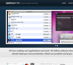
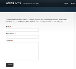
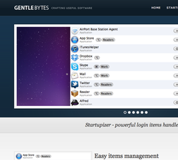
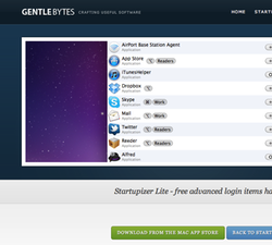
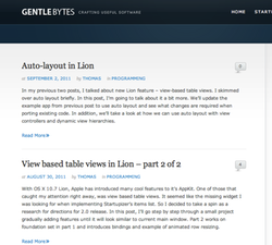
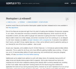
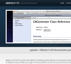
Anthology is visually simpler theme than Highlight, but we love clean lines and simplicity. We also prefer serif fonts, so with Georga as main font, it fits a bit better our taste. Pages tend to occupy more vertical space than highlight versions, partially due to taller header. See side-by-side comparison below.
Conclusion
Overall, the conversion process went smoothly, actually much smoother than changing Word Press theme. There were few hiccups, but these were minor and we thoroughly enjoyed the process. The net result of converting to static content is bringing site maintenance and updating work to minimum while giving us full power of customizing parts that require it. And we don’t even need test site on our server anymore: we can do it much more easily and faster locally.
There are still bits missing, for example blog archive, but these are minor and will be added with time. Was it worth it? We definitely think so. While Word Press is wonderful platform for quickly building a site without requiring any HTML or CSS knowledge, it can turn into customization obstacle for tech-savvy user. And static site has an additional bonus of being able to serve much larger traffic without hiccups. Although this site doesn’t need that yet, we should be ready for a smaller fireball :) And now back to Startupizer.
Oh, yea, just before that: here’s the comparison of the pages side-by-side, let us know what you think. First landing and contact pages:
Startupizer pages:
Blog and post pages:
And appledoc page:
