Sporting new look
Gentle Bytes site has new look! This post talks about the changes and reasons for them.
A little background
In november 2009, approximately one and half year ago, we proudly announced a new look of the site. Well, that was in fact the first one ever, we used generic hybrid theme beforehand. So even though the site was few months old already, it felt like this was the actual start! We worked with designer Kayla Knight on it and agreed to have her implement the site up to HTML/CSS templates, and we’ll use them for integration into a WordPress theme. Dealing with PHP and WordPress for the first time ever, it took a while, but finally it was ready!
But the devil lies in details as they say; managing content was painful. Blog posts were relatively simple, we could do it with MarsEdit, but pages were another beast - to get them done, we had to use custom PHP code injected into the theme itself. So to see the difference, we had to update the code, upload and finally reload the browser. Doable, but far from user friendly. Adding subpages was fine as long as the main menu structure would not change - that would require hitting the graphics files, drawing the menu in all possible states, uploading, checking, then correcting and repeating the whole process again. Furthermore - editing content over multiple computers was painful too, and editing directly in web interface most probably resulted in unsynchronized content. Additionally, preparing and testing new content in a test site was only possible to some extent, and we had to tweak final settings on real site resulting in occasional PHP errors and such. Oh, and updating WordPress, parent theme or any of the plugins… let’s just say we always held our fingers crossed. To be honest, most of this was due to the way we implemented the theme, but that’s how it was.
Themes, themes, themes
So recently, browsing the web, we came across Highligh premium WordPress theme. Taking a closer look, we realized the potential to use it for our site too. But we had concerns in the back of our mind: first of all we tried with few generic themes already, but it didn’t work out as there was simply too much customization required and all pages looked kind of dull and the same. Secondly: wouldn’t we lose unique look of our site? But the theme included a lot of room for customization, so after thinking it over, we went ahead and bought it - $35 isn’t really that much, and if we would not be happy with it, well, at least we would support the designers behind it, they really deserve it…
So we installed it on our testing site and it looked nice enough to start with. First, we created the main page with “cards” linking to our products, same as on old site and it looked really dandy. Encouraged with results, we started creating static pages for Startupizer. This was the time we needed to create child theme in order to get some custom CSS styles going. Nothing fancy and with CSSEdit it was done in a breeze. We did the same for contact page. Looking at the results we were even more impressed and at that point we decided we’ll go for it. So we slowly moved over the rest of the content - we simply imported all blog posts. Note that until then, we even didn’t have to override ANY CSS style or anything else - it all just worked out of the box! Then we went over all blog posts to identify spots that would require brushing. The only thing really was adding few styles to our CSS and reformatting images to show the nice border - with find and replace it was done in matter of minutes (thankfully we’re not much of a blogger, but otherwise it could probably be done by manipulating WordPress export file)!
After finishing the blog, we put our focus on the remaining pages. We didn’t copy them over from previous blog as we wanted to restructure the whole layout, so it felt it would be quicker to just copy the text where applicable (in fact, even if we wanted, we couldn’t as all HTML was hidden away inside theme files). This step required playing with included photoshop file, but that was only because we wanted to have more prominent buy/download buttons. We also used Photoshop to change logo (thankfully it wasn’t done in some exotic font that we would need to go hunting for). All in all, it was done real quick. Actually what took most time was preparing feature images and restructuring descriptions. It was a fresh change from everyday programming though.
When finished, we started playing with various color schemes to see how it would affect the look and here it is - our brand new site… And we didn’t have to tweak any PHP AT ALL! Well, to be honest - we did override header and footer to get nicer copyright and better title tag for SEO, but these were really minor things and will probably be addressed by theme creators in future versions.
Conclusion
So here we are - with our brand new look. It’s simple and elegant. And it’s breeze to edit content - we can do almost everything within MarsEdit or, if need be, directly within WordPress admin pages. How about “genericness”? Well, looking at theme demo and our implementation, it almost looks as another theme - different logo, content images and positioning of elements makes all the difference and gives site the unique look and feel. And customizing overall color scheme is a matter of point and click - it really shows that theme designers and coders went through a lot of effort! And it came with a fraction of a price we used for original one. Don’t get us wrong - we still think Kayla did a hell of a job and it was sure great startup push!
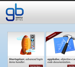
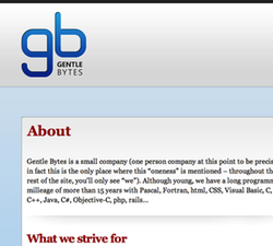
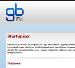
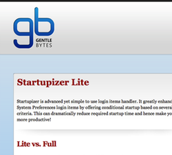
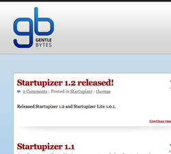
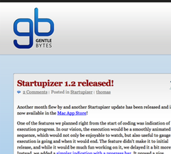
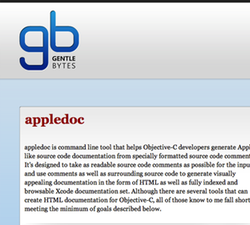
Oh, there’s one thing we don’t like and that’s sites that change the skin and brag about brand new look but neglect to show the old one! So here it is, for your comparison and judgement - click on thumbnails to get side by side comparison of the new vs. old (once you open an image, click on the small X in the upper-right corner to see it in full size). Let us know what you think:
Landing and contact pages:
Startupizer pages:
Blog and post pages:
And last, but not least - appledoc:
