Making of Startupizer
Every software has a story behind it and so does Startupizer. In this post, we’ll write about the store behind the Startupizer - from the idea to launching in the Mac App Store!
Initial development
The idea and initial development started at the beginning of 2009 and first workable solution was finished in matter of a week or so. It wasn’t going to win any beauty contest, but it wasn’t meant this way. It was really just a quick solution that helped us manage our Login Items and allow us using our computers more productively. And it served it’s purpose for many months. In fact, it wasn’t until around the middle of 2009 when we though this kind of tool could be useful for other people too, and so the idea of creating shareware application was born.
The first idea was to simply “beautify” the user interface and release the app. But as the source code running it was really just quickly put together to solve immediate problem, we decided it won’t be able to provide stable platform out there “in the wild”. Originally Startupizer only included startup conditions based on modifier keys and time but we’ve had many more ideas for different startup criteria and existing code base certainly wouldn’t allow much extension. It wasn’t meant that way.
1.0, take 1, action!
So we went back to the drawing boards and prepared the list of different startup criteria we’d eventually like to implement. The list included modifier keys, time based criteria, power supply based criteria, delayed and dependent execution, internet access, handling daily, weekly and monthly cleanup jobs and more. Although this kind of swiss-army knife type of app would certainly appeal to greater range of users, it could also lead the project to premature halt due to it’s complexity and require effort for features that perhaps nobody would really use. Instead we decided to only include the first two features from above list for 1.0 release and then add more based on user feedback. This was something we needed most anyway, so even if nobody would want the app, we could still use it ourselves.
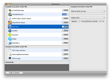
With feature set decided, we continued with first mockups of the user interface. At first we just played with our ideas inside Acorn to get basic layout of the main items list. Our initial idea was to have items grouped and each group have it’s set of startup conditions assigned. So all items of that group would start according to the conditions assigned to the group itself. Here’s one of the mockup images:
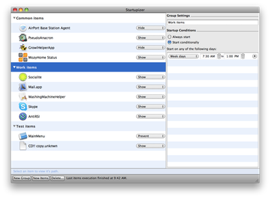
We also decided to have the items list implemented with a custom view using Core Animation, so that it would end in smooth user experience with subtle animations and all the rest of the goodies. And after some weeks of coding we finally had our first working solution ready. Here’s a screenshot of that UI, although taken a bit later on. The UI already includes startup conditions editor, although that’s not really usable and clicking the buttons wouldn’t result in any action, it’s there just to visualize how it would fit together at the end. In fact at this point we even didn’t implement editing of group names, hence the screenshot just features generic auto-assigned names:
Overall it was working nicely. The screenshot can’t show this, but the list was smoothly changing it’s state, for example when selection changed, it faded from one item to next etc.). But the code behind required to run all these whistles and bells, was getting more and more cluttered and after a while it was difficult to get consistent results. Sometimes items would just “hang in the air” instead of being listed in order. So we decided to refactor the code, cleanup things a bit and rethink the user experience.
1.0, take 2
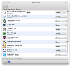
After giving more though of how the user is going to interact with the application, we decided to leave aside our Core Animation items view and start with simpler, standard tree view instead. This is something Mac users are familiar with, so it should be simpler to pick up the app. This alone marginally reduced the amount of code and we could instead focus on usability and getting lower level handling of items right. This soon lead to first fully workable version - somewhere in the middle of february 2010, after month and a half of work, we finally got a version which could replace our original concept application created more than a year ago. In fact, from that day on, we’ve started using Startupizer for our login items and haven’t stopped yet. Here are a couple of screenshots demonstrating various states of the application at that point:
Note that as above screenshots didn’t allow changing startup conditions, we had to manually tweak the values in the database and restart the app to have them accepted. But as Startupizer is kind of set-and-forget type of app, this was enough for us to test it for the time being.
The application was working fine but using it seemed to be a bit confusing. Especially using modal sheet for importing system items and having groups of items seemed counter intuitive. After thinking of various possibilities we decided to prepare a quick mockup using single flat list of items, with each item having it’s own set of startup conditions. This would result in much more flexible runtime behavior with arbitrary execution order regardless of startup criteria. We preferred the new way of handling and it also seemed much more intuitive, so we decided to restructure the application.
1.0, reloaded
The work started at the end of february 2010. Although we were happy with much of the code from previous incarnation, we anyway decided to start a fresh project and copy all the code we liked and reimplement the one that was being unnecessarily complex. It took somewhat more than a month and in the middle of april, the whole of the functionality of take 2 was implemented and from this point on, we could replace our trusty take 2 version as our login items handler. This time, startup conditions editor was actually live and we could tweak the values directly within the app - for the first time since the original concept app!
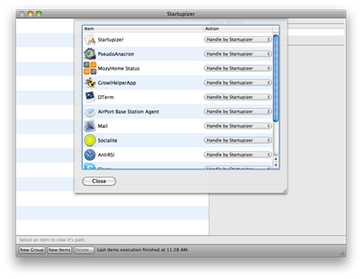
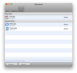
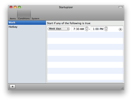
One of our primary thought with the redesign was in startup conditions editor which required a minimum width in order to be fully visible and hence usable (it requires from/to time editing fields as well as day selection control - in fact just for this feature alone we spent quite some time and played with various ideas to make it as small as possible). As in take 2 conditions editor was present all the time on the right part of the screen, the main window was unnecessarily wide and focus was moved away from the items list. Hence, the new version divided the main window into three panes: main items list, startup conditions editor and system items list. There were nice push/pull transitions when switching between the main screens (note there are no icons yet):
The list of ignored items was looking similar to main list:
As startup conditions editor occupied the whole window now, we could keep windows size smaller without sacrificing the usability:
At this point we felt the application is getting ready for testing in larger groups, so we started looking for initial group of testers to get some feedback. At the same time we started looking for a designer for the main icon and toolbar icons. And from now on, we were basically just polishing the application with feature set closed until final 1.0 release. We put most of the focus on making startup conditions and system items handling as streamlined and simple as possible. With testing we decided to rework the main window to only include main items list and combine startup condition selection with editing into a single panel. This left system items list on the main window besides the main items list. So we decided to move them to separate panel too and only show it when needed. After this the application soon got it’s final form!
1.0 revolution
At this point we also started working more intensely on icons and other images with the designer. We outsourced this with people behind Excedo company. Although it took a while, it was well worth it - we were really pleased with the quality of the icons, it really made the difference! It was so evident that these folks have been working on software projects before (in fact, they have their own iPad and iPhone apps available on the App Store)! For example: we had rough ideas of how various images and icons should look like, but no idea for the main icon. So we left that for moment being. However the designers were really creative and prepared the draft of the rocket with an S over it. And even on the first draft we just looked and we were all “Yes! That’s it!”. It then took just few quick iterations to work out the details - adding clouds, apps panel and polishing stuff a bit:
Note that the example icons on the screenshot still use placeholder icons, the final app icon features fellow OS X indie developer app icons - can you guess which? We’re giving away Startupizer promo codes for first few readers with correct answers - read on for details!
What’s it worth if we can’t sell it?
While waiting for next icons, we started looking at integrating online shop to our website. We investigated various possibilities, but at the end settled with Fastspring. They really offer first class services, have very responsive customer support so we soon had our online store working and connected! If you’re starting your own business give these guys a look, it’s really worth it!
But things go their own way and it was during this time that Apple announced the opening of the Mac App Store. Even though we had the whole licensing and online store prepared already, we though about it for a while. There were really two things on the scale here: Fastspring charged 10% of the income while Apple 30% (plus for both there were expenses related to wiring the money, so more correct figures would be 15% vs. 40% for where we live), also Fastspring has excellent back end for managing the store with many options available, but on the other hand App Store has the potential to reach much more people. And this argument won at the end, so the final push was on to prepare the application for the store. This required some modifications, primarily changing licensing and registration scheme and update mechanism, but also required some subtler changes. We still have our Fastspring store open though, although it’s not active.
Conclusion
Although we had working prototype for our personal use long before we even got the idea of releasing it to the world, it took a lot of time and hard work just to polish the application to reach the level we envisioned! There are many, many decisions behind every software; end users rarely imagine this and we’ve outlined just a few of them.
Perhaps we’re just purists - not only we require the software we use to be useful and make us more productive, we, as Mac OS X users, also prefer simple, polished and nice looking one (that’s one of the reasons we switched to Mac years ago)! And we have same demands for our software too - if not higher! However as with all things in the world, you need to find the balance - in software between feature set, stability and invested time among other. Many times we as users forget the developers also need to feed their families and pay their (our :) taxes at the end of the day…
We didn’t think it would take so long to polish all the loose ends, but we’re happy we persisted through all the moments when things were not working for us. And even though we knew from the start Startupizer isn’t generic app that everyone would use (although this is true for majority of other applications as well), we still put our 100% into making it! We knew it’s kind of an edge case, but for those who experienced issues with login items, it is a welcome help.
Looking back - would we repeat it again if we knew in advance all the effort it would require? The answer is no brainer: definitely yes! We’re software programmers by heart, we love spending endless hours working with bits, bytes, words and all other “boring” stuff that makes today computers user friendly and apps nice to work with. And we also love sharing our work with others to make them more productive and efficient in things they love! We’re happy with the feedback we’ve received and are currently starting the work on first update - shortly described here!
Promo codes giveaway!
Thought we’ve forgotten? Worry no more: we’re giving away Startupizer promo codes for first 5 readers who answer our question correctly: Startupizer’s application icon features 4 indie developer application icons, which are these applications (or their developers)? Answer either by commenting this post below or through our contact form. Tough? We’re making it really easy for you, the answer lies on Startupizer’s page (oops :)) somewhere on our website ;)!
